USING MOOD-EVOKING COLORS IN YOUR HOME
TEXT by Jasmine Bible PHOTOGRAPHY by Jennifer Morgan Photography
Is there an emotional connectivity between ourselves and the spaces we inhabit? Can certain colors make us happy? Often when we think of decorating a room, we begin with color—we choose our favorite color and build a design around it. What if, instead, we took a step back and chose a color based on the feeling we wish to achieve in the room?
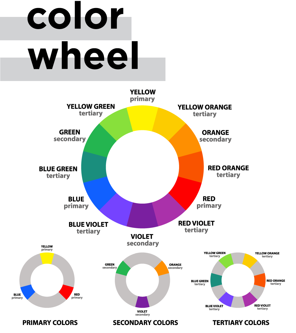
To begin, let’s take a quick refresher course in color theory. At its core, color theory is a collection of guidelines on the use of color, intended to allow a person to make intelligent choices when choosing colors. Philosophers and academics as far back as Aristotle have studied color and the ways in which colors relate to one another. In 1666, Sir Isaac Newton developed the color wheel, defining three groups: primary colors, secondary colors, and tertiary colors. The most commonly used 12-hue wheel helps us to understand color and color relationships.
WHAT THE EXPERTS SAY
Now that we know the ways in which colors interact with one another, let’s look at the ways in which humans react to color. We chatted with Melissa Chipman, an art teacher at the American Academy of Innovation in Utah, to get a better understanding.

On a neurological level, your brain responds differently to different colors (wavelengths of light), and requires varying levels of subconscious energy to process each color. “When viewing contrasting colors, your eyes are experiencing a sense of heightened energy—there is a dynamic conversation happening between contrasting colors that causes your brain to continuously shift between the two, actively processing this dialogue,” explains Chipman. This can be ideal for evoking certain moods like hunger, excitement, or inspiration.
Conversely, complementary colors that exist next to one another on the color wheel work in tandem to create a harmonious balance, resulting in a more calming or relaxing atmosphere.
So how do these color rules translate to your home? Interior designer Susan Brunstrum of Studio Brunstrum shares her tips:

RED can be bold and dramatic or warm and earthy, depending on the tone. Deep crimson hues create passion and drama, while rusty shades can add a cozy ambiance. Red is best used in areas where energy should be high, like a family room or entertaining space.
ORANGE hues are bright, fun, and energetic. Since orange is a combination of red and yellow, it makes sense that it would have all the vivacity and warmth of both. Used in large quantities, orange can feel overwhelming, but softer peachy or terra cotta shades can be cozy and calming.
YELLOW is usually associated with sunshine, energy, and happiness. It reminds me of my last vacation to Mexico. It also can spark creativity and encourage communication, which might help if you have teenagers at home! But if it’s overdone, it can cause anxiety and stress.
GREEN brings to mind nature, balance, and harmony. Deep emerald or hunter green can add intensity and elegance, while light spring or sage green is soothing and helps stimulate focus and creativity.
BLUE tones are typically associated with calm and serenity. It’s a great color for spa-like bathrooms and peaceful primary bedrooms. Deep navy or royal blues add a masculine feeling, while light powder or sky blue hues are versatile anywhere you need a bit of relaxation.
PURPLE has long been the color of royalty, and can inspire creativity and spirituality. Deep rich plum or violet can add a bold, exotic flair, while light lavender hues are calming and pair well with greys and oranges. It’s also a popular choice for kids’ rooms—studies have shown that nearly 75% of pre-adolescent children choose purple over any other color.
PINK can add a touch of feminine flair, and it has seen a huge increase in popularity over the past few years, with blush and “millennial pink” shades being in vogue. Muted blush or greyish-pink hues can instantly soften any room, and darker shades of magenta add a punch of drama.
BLACK Just like my favorite little black dress, this color has always been associated with sophistication, elegance, and luxury. It’s most often used as an accent in the home, as all-black interiors can become dreary and overwhelming very quickly. Glossy or matte black accents, furniture, and appliances are timeless and chic.
WHITE is the color of purity and cleanliness, and often is regarded as a blank palette. With the rise in popularity of Scandinavian design in recent years, more and more designers are leaning towards all-white walls and sparse white furniture. White interiors can feel fresh and modern, but can also be very cold and barren without the proper accent pieces.
BROWN accents such as wood tones, leather, and natural elements are a great way to warm up a space and make it feel homier in an instant. Brown shades are truly versatile, and go with any design style and mood.
REAL WORLD EXAMPLE
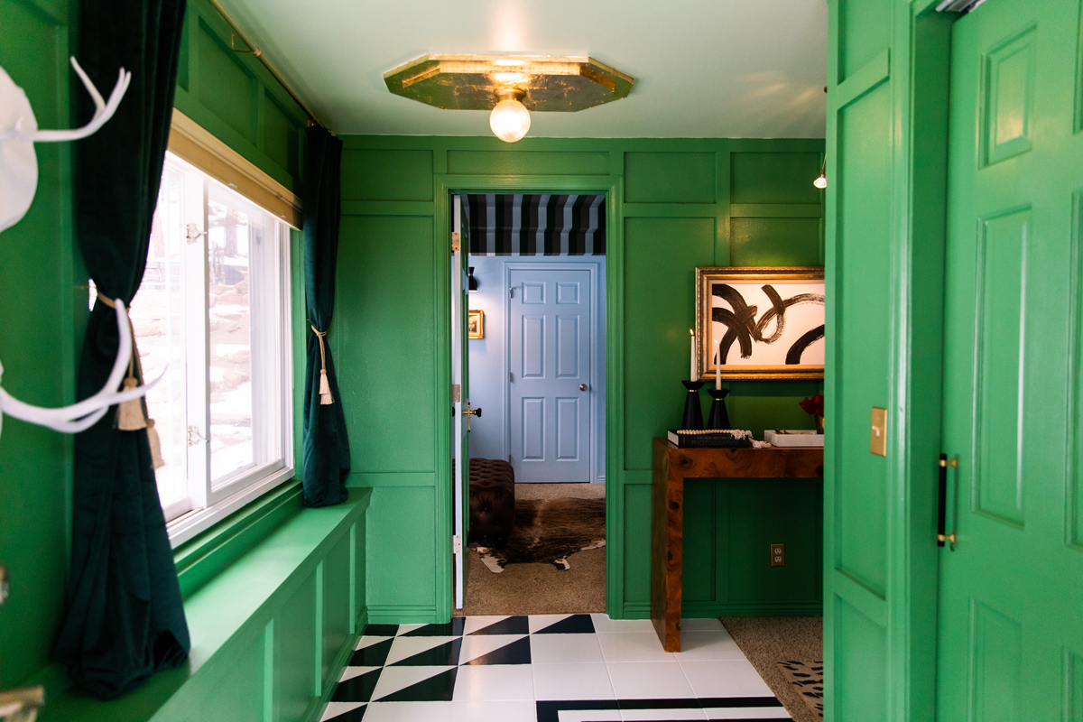
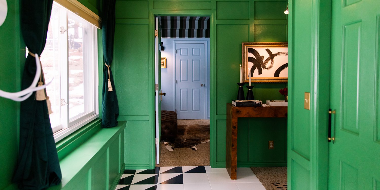
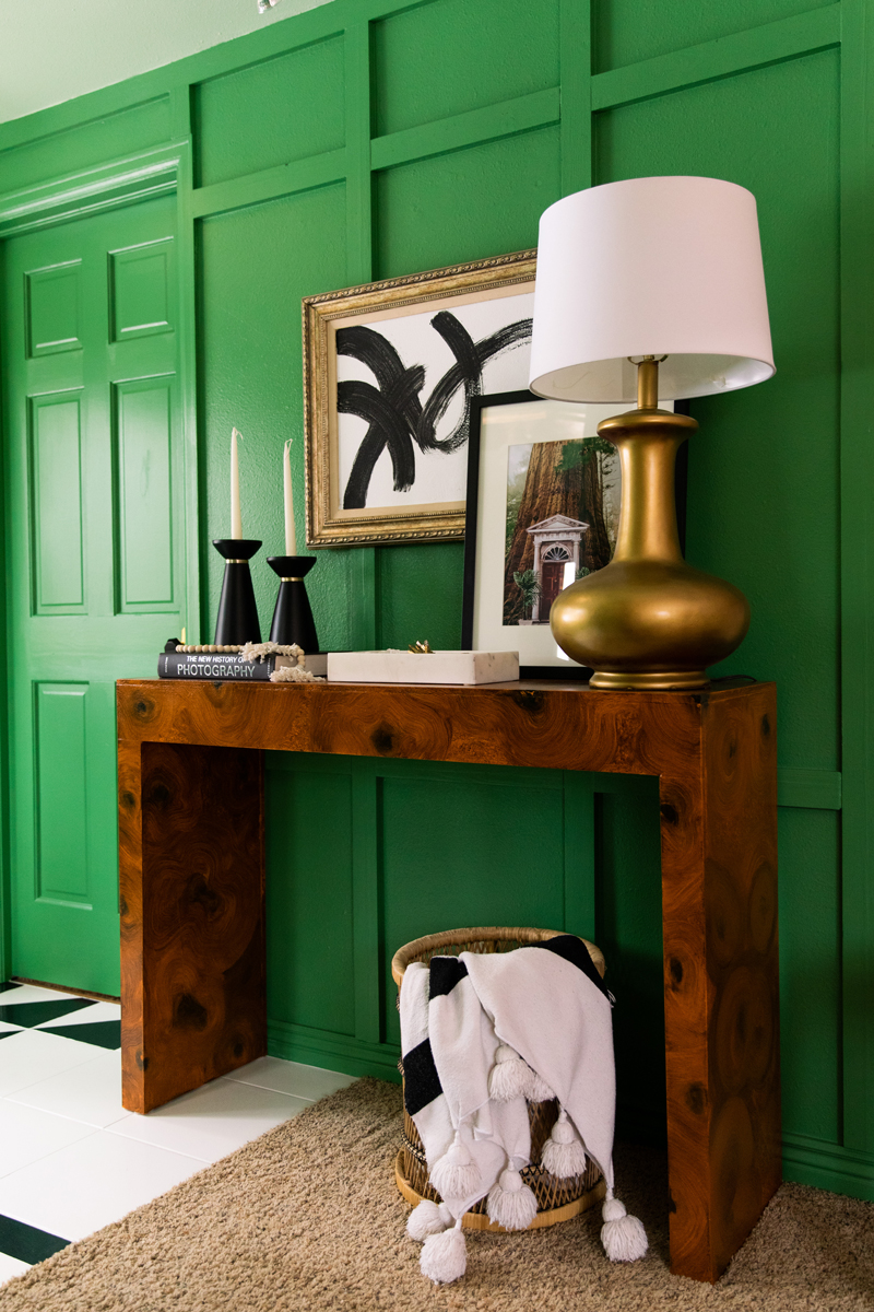
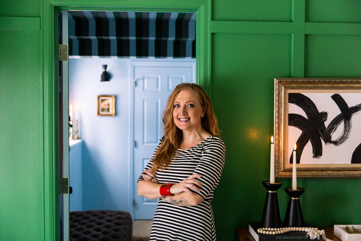
In this foyer, designed by our Editor-in-Chief, Jasmine Bible, Bible wanted to establish a connection between the interior and exterior of her mountain home, surrounded by tall evergreen trees. There is now a feeling of harmony between nature and what is to come in the remainder of the colorful home. A rich green, Matcha Latte by Clare, brings a sense of refined elegance to the walls, trim, and doors to create an intense, enveloping feeling, as if you were inside an emerald jeweled box.
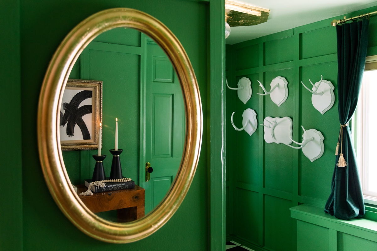
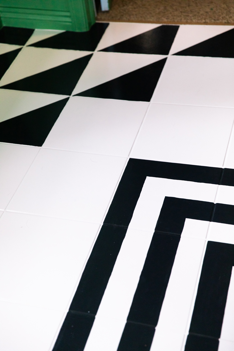
To further this cocoon effect, a lighter green, Two Scoops by Clare, was used on the ceiling instead of the traditional ceiling white. On the floors, a graphic black and white geometric pattern leads you into the main living areas. Shed antlers (those found on the forest floor, not hunted) have been coated in a matte white, providing a sculptural element.
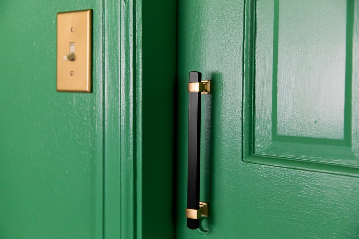
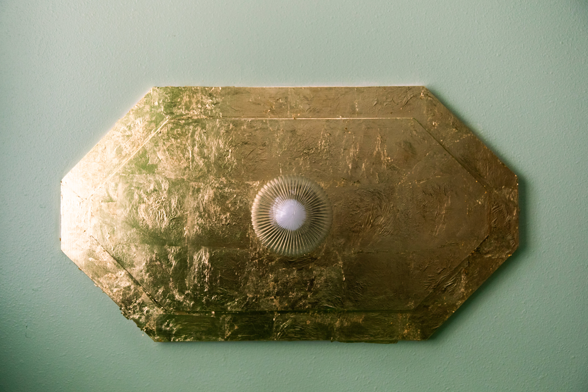
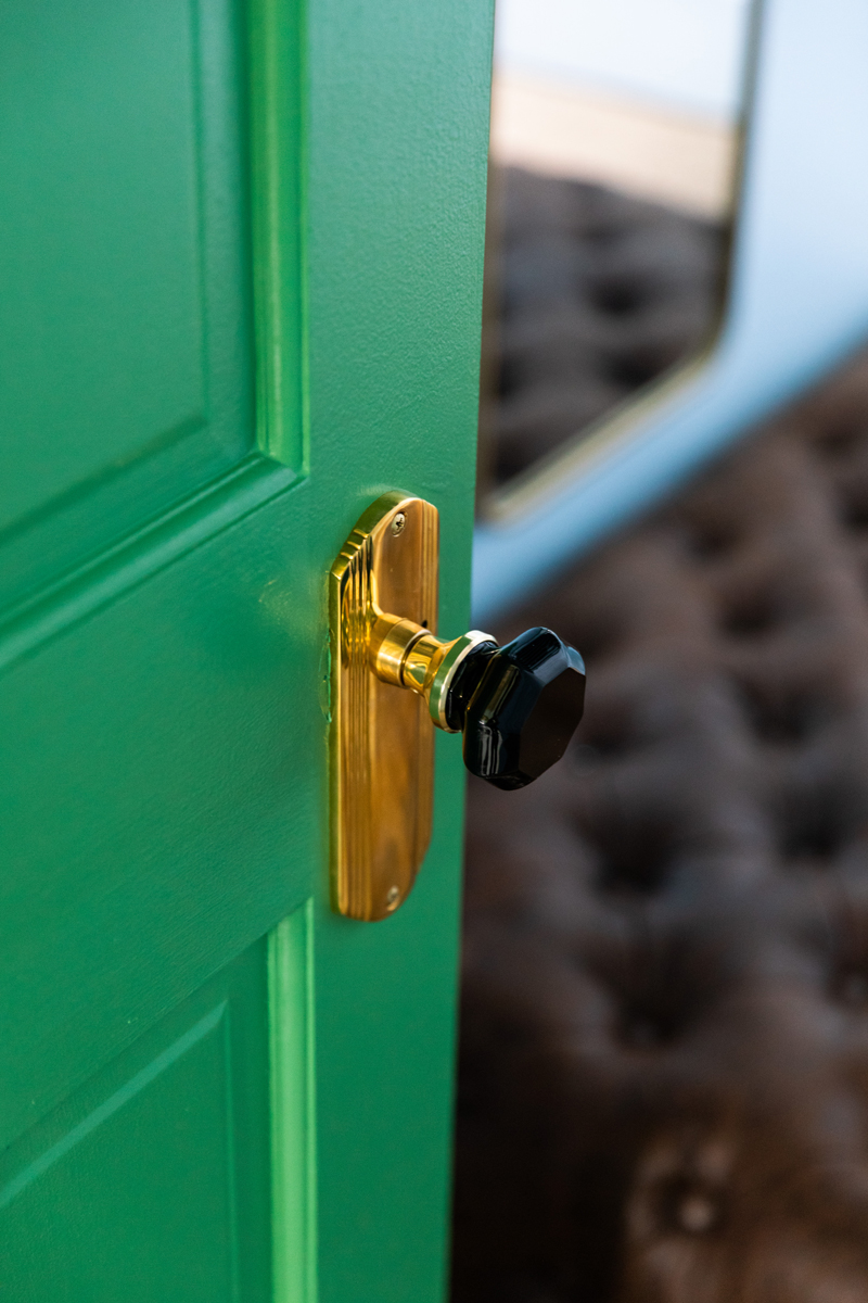
Notes of art deco are found in the luxe door hardware, floor pattern, and the shape of the custom ceiling medallions.
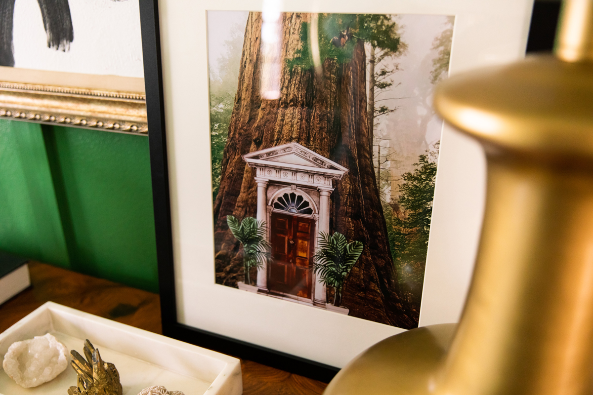
Tiers of lighting work in layered harmony: the large gold table lamp, art light, the ceiling fixtures, and the wall sconce in the dressing room beyond. The redwood tree collage artwork by Paul Abrams sits atop the burl wood console table, another nod to the natural landscape that exists just beyond the windows.
As you begin to make color choices, consider the scale. The bold emerald feels sophisticated in this small space, but in a huge living room it could feel garish or oppressive.
Now that you’re armed with a deeper understanding of color and color theory…how will you use it? We want to see! Use the hashtag #SOnesty to show us how you use color to create a calming retreat or a high-energy contrasting combo.
We shared this color theory article with you in the Spring/Summer 2021 Issue of NEST Magazine. To view the full issue, click here.
Written by Jasmine Bible on May 14, 2021
-
Don’t Miss This Prime Spring Window To Sell Your House
According to Realtor.com, the best week to list your house this year was April 13–19. Continue reading -
4 Ways To Make an Offer That Stands Out This Spring
Now that spring is here, more and more buyers are jumping back… Continue reading -
The #1 Thing Sellers Need To Know About Their Asking Price
When you put your house on the market, you want to sell… Continue reading -
Paused Your Moving Plans? Here’s Why It Might Be Time To Hit Play Again
Last year, 70% of buyers abandoned their home search – and maybe you were… Continue reading
